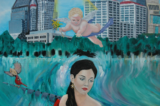
Welcome to the LOUISA VILLEA... 

...a simple and informative study
in the 
 Elements and Principles
of
Art.

(Based on the 2008 oil painting
by American artist and teacher
 Rich Thompson)
http://www.richthompson-art.com/

This study uses
 Louisville, Kentucky, USA's 
premier painting,
the Louisa Villea
to show
how each
art element and principle
is used,
and to show how all
 the elements and principles
work together to produce
a painting.

For more information
connected to this painting visit:


A Composition is the combining of parts to make up a whole.

A painting is an artistic composition.

Elements of Art and Principles of Art are combined to compose a painting.

The Elements of Art are: Line, Shape, Form, Value, Color, Texture, and Space.

The Principles of Art are: Variety, Contrast, Unity, Movement, Balance, Emphasis, and Rhythm.

Aesthetics is the study of beauty.  An artist strives to make his or her artwork aesthetically pleasing, according to his or her own interpretation of beauty.

LINE

A line is a continuous mark made on a surface.  Think of a line as a moving dot.
     In the Louisa Villea, line is used primarily to define the contours of the objects.  Contour is the outline or edge of a figure or shape.  Most importantly, line defines the appearance of Louisa herself.  This painting started with a pencil line drawing of Louisa's face.  Beginning with the eyes, it was important that the proportions were anatomically accurate in order to render the portrait in a realistic style.    
     A fine line continued the contour of her body keeping proportions accurate.
     Definite lines were used to present the birds and the infant-like characteristics of the cherub in a realistic manner such as was used by the artists of the Renaissance period (1500's to 1800's).
     In the background, the buildings of Louisville used lines that were less defined.  The contours around and within the buildings are not as clean and straight.  This loose definition presented the background (and even the bench) in a style similar to the Impressionist painters (late 1800's).
     The dream-like, swirly lines and shapes throughout the painting are indicative of the style used by Abstract Expressionist painters (mid 1900's-).

SHAPE

Lines create the outline of a shape.  A shape is the space or area created by the contour of a line.
     In the Louisa Villea, various shapes are used throughout the painting to add interest.  The man-made buildings in the background are basically organized, geometric shapes such as rectangular, square, oval, and triangular.
     The natural occurring shapes such as the trees, the birds, and the human form are not as geometrically organized, since straight lines do not appear in nature.
     The Louisa Villea also uses negative shapes to enhance the composition.  A negative shape is the open space created by the edges of solid shapes around it.
     Notice the shapes of the open spaces between the slats of the bench.
     Notice, also, how positive and negative shapes were used together in the treeline to create hidden images.  Can you find the jockey and thoroughbred horse on the right side of the painting?  Can you find the outline of Louisville's founder, Gen. George Rogers Clark as he appears in Louisville's Belvedere statue?

FORM

Forms are shapes that are usually three-dimensional.  However, in a painting, shapes and objects can be highlighted and shaded to give the visual illusion that something is three-dimensional.
     The Louisa Villea is a two-dimensional oil painting.  This means it is a picture on a flat panel or canvas.  The objects in the painting can be measured two ways, height and width (up and down).  Highlighting and shading are used to create the illusion that objects in the painting have a third dimension or depth.
     Proper highlighting and shading give shapes the appearance that they are realistic and have form.
     Notice the subtle highlights and soft shadows on Louisa and the cherub.  The slight variation in color and lighting turns a flat shape into a realistic looking form.
     The light and shadows on the buildings suggest volume and turn the geometric shapes into three-dimensional form.

COLOR

In painting, there are three primary colors (red, blue, and yellow).  All other colors are made from different mixtures of these colors.  You can add white to lighten or tint a color.  You can add black to darken or shade a color.  You can add a mixture of black and white to "gray up" or tone a color.
     In the Louisa Villea, color is perhaps the strongest element of art used.  Louisa wears a red gown as she sits on Louisville's Great Lawn.  On the color wheel, red (a primary color) is directly opposite green (a secondary color).  Opposite colors next to each other in a painting offer a strong visual contrast.  The green lawn allows the red gown to stand out.  This helps draw more attention to Louisa, the main subject of the painting.
     A wide rainbow of colors, of varying intensity and value, was used in the Louisa Villea to add visual interest to the painting.

VALUE

Value is the lightness or darkness of a color.  In painting, shapes can have various degrees of lightness and darkness to give it the illusion of a three-dimensional form.
     In the Louisa Villea, the main subject, Louisa, appears to be a realistic human form because of highlighting and shading.  By highlighting and shading in a realistic, natural manner Louisa seems to be three-dimensional.  It seems as if you could actually walk around her.

     Notice how value is used in rendering the buildings.  The buildings would appear flat if it wasn't for the light hitting on one side and casting shadows on the opposite side.  Value makes the buildings seem like they have form and hold a volume of space inside of them.

...Continue by clicking on Older Posts below...